Welcome back everyone and happy Tuesday! This week we are going to have a look at how we can enhance details in poor-contrast images. We will do so by proportionally changing pixel values and we will use our good old friend, the Histogram, to assist us while we do so. Grab a coffee or tea and read on!
The Issue with Contrast and Variation of Pixel Values
When we struggle to see detail in an image or video clearly, it is usually down to resolution, compression or poor variation of pixel values. We can’t do much about the first two problems. However, if we have a video, we may use frame integration and super-resolution to improve detail rendition. With poor variation of pixel values, we can increase the variation range, a process also known as “stretching the Histogram”.
As we know, in an 8-bit depth system, pixel values can range from 0 to 255 where 0 is pure black and 255 is pure white (or full-color complement). In a monochrome image the closer your pixel values are to 255, the lighter they will be. In a color image the variation will apply to the three red, green and blue (RGB) channels. The closer the pixel value is to 255, the more the prominence of a specific color.
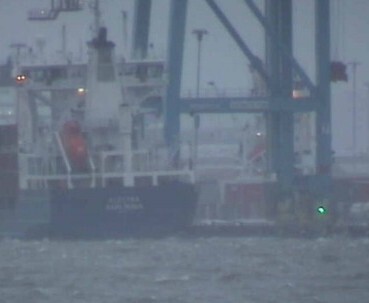
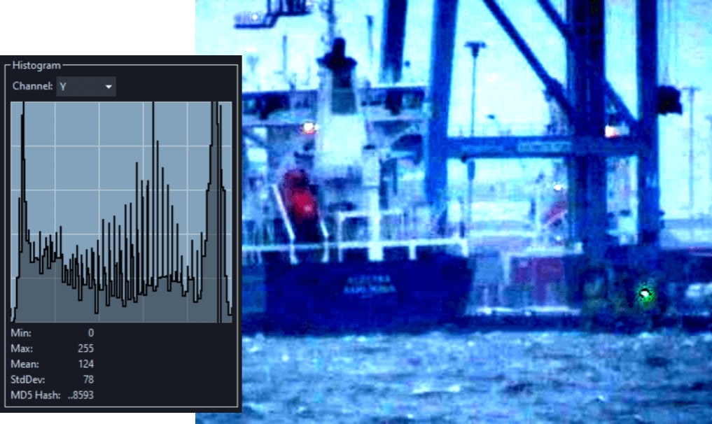
In the image above, for example, there are no very dark and no very light pixels.
The Histogram
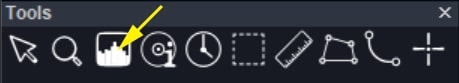
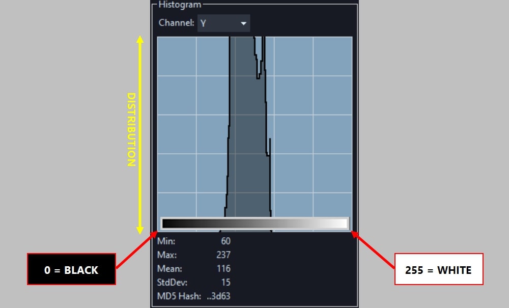
We can mathematically corroborate these findings by looking at the Histogram. This is a graphical representation of the overall distribution of pixel values in an image. In Amped FIVE, the Histogram is the third button in the Tools panel.
Let’s have a look at the histogram for the above image of the port. By default this shows us the luminance (Y channel) of pixel values in the image. It is telling us that they are all neither dark nor bright.
If we click on the Channel drop-down menu and change the selection from Y to G, for example, we will be monitoring the pixel values for the Green channel only.
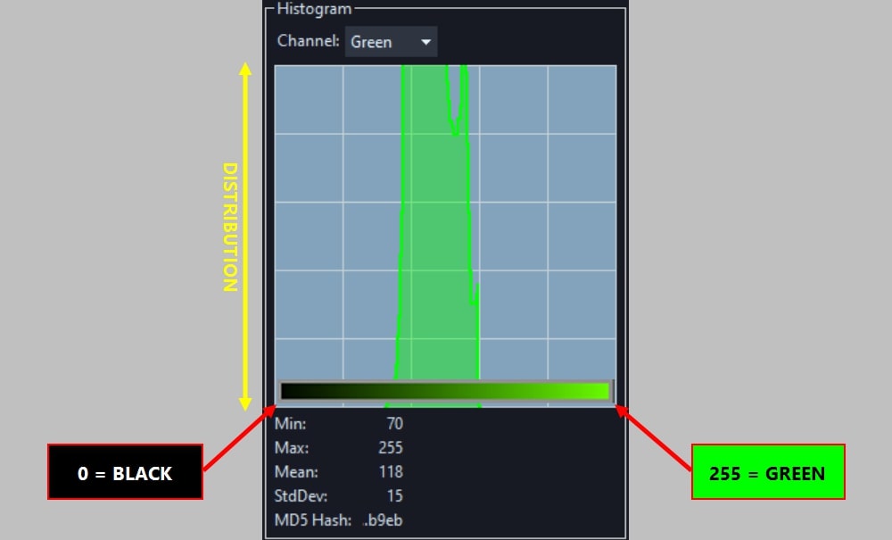
In this example, we have a rather uniform and healthy variation of pixel values. This includes the current narrow ranges of luminance and green values (as well as the red and blue values). We can increase the variation of luminance between these values. This will make the darker pixels in the image (which are not very dark at all) as close to pure black as possible and the brighter pixels as close to pure white as possible. We can also do a similar adjustment to the green channel, or any of the other color channels, if we so wish.
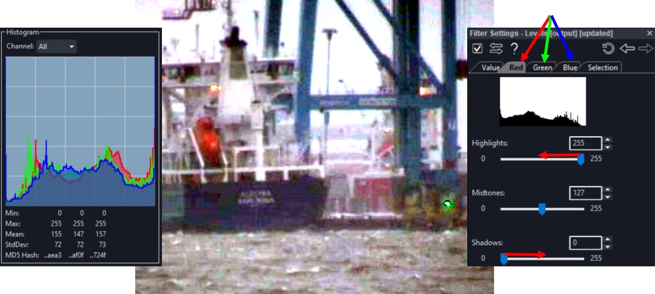
Performing a Levels Adjustment
Load an image with poor detail contrast and apply the Levels filter from the Adjust group in your chain.
When the contrast is poor, we can push the Highlights slider down and the Shadows slider up within the Levels filter settings to stretch the pixel values from the middle of the Histogram to either direction. Note how your values in the Histogram will visibly extend as you are doing this.
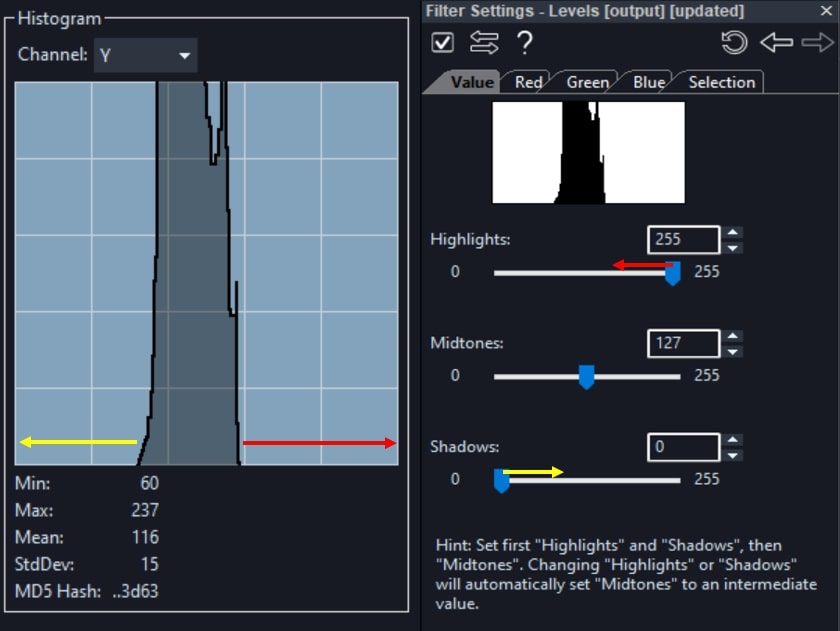
When your darker pixels are getting close to the minimum value of 0 and the brighter pixels are getting close to the maximum value of 255, you will want to stop stretching the Histogram. Otherwise, you will start losing variation of the darker and lighter pixel values. An issue also known as saturation, which we will discuss later in this article.
Have a look at your processed image. Notice how you now have a uniform variation of values ranging from pure black all the way to pure white.
Check out this video on our YouTube channel. You will learn how to adjust luminance and color levels in Amped FIVE in order to enhance details in an image.
Balancing the Colors
Stretching the range of luminance values has brought out even more of the original blue tint inherent in the image. By using the Levels filter, we can apply the stretching process to individual R, G and B color channels. This helps in restoring a balanced presentation of colors. Simply click on the individual Red, Green and Blue tabs of the Levels filter settings to adjust them one by one.
Monitor the Histogram for the respective color channels until you have widened the range of pixel values for all.
The image has now been nicely balanced both in terms of luminance and color. If you want to save yourself some time you can also perform an automatic adjustment by using the Automatic Color Equalization filter or the Smart Adjust filter in the Adjust group. These will equalize and nicely balance all pixel values in an image.
Monitoring Saturation
As mentioned earlier, whenever you adjust pixel values, you have to be careful not to overdo this process. Otherwise, you may push darker and brighter pixels below and above the minimum and maximum values of the available range (i.e. from 0 to 255). This in turn will null out any existing variation of values, effectively removing detail contrast in your image. You may, however, also want to do this in some parts of the image that are not of interest. This helps in achieving better contrast in areas that are of interest, such as a license plate or a suspect’s face.
In FIVE you have the ability to monitor closely what you are saturating in the image and where. Using the same port image as an example, we can enhance the variation of pixel values around the wording at the rear of the vessel. This is achieved by further adjusting Highlights and Shadows within our Levels filter.
In your Histogram tool, tick on the “Show Saturated Pixels”.
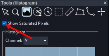
Then, push the Highlights slider further down and the Shadows slider further up within the Levels filter settings. In the illustration below, you can see the saturated pixels and how the image actually looks with that much saturation.
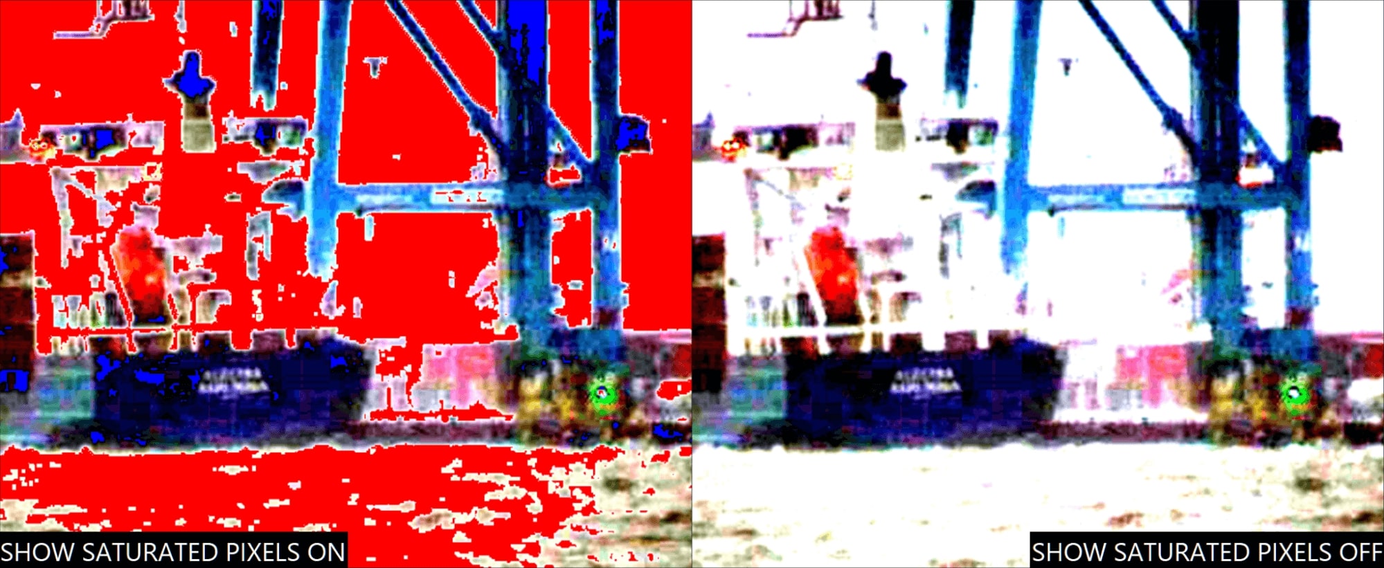
The pixel values that have reached the maximum of 255 will be rendered in red and those which have reached the minimum of 0 will be rendered in blue. In this case, we are losing variation of values in many areas of the image, such as the sky. However, we can clearly see that saturation is not occurring near the area of interest. Additionally, we achieve the best contrast of pixel values within that specific region.
Conclusions
Remember that, whereas we all perceive changes in luminance the same way, perception of color is subjective. This is because of the way our human eyes are made. What may appear to be an adequate color representation to yourself in an image, may not be as much to another individual. If you are analyzing detail alone, you always have the option to render your image in grayscale. This will throw the issue of color perception out of the way. Find the Grayscale Conversion filter in the Channels group.
We hope that you enjoyed this week’s content and don’t forget to check back in next Tuesday for another article. Until then, as always, stay safe and take care.