Dear friends welcome to this week’s tip! Today we’re showing a simple yet very handy feature of Amped FIVE: the Histogram tool. We’ll briefly explain what the image histogram is and how the Histogram tool can help you work your way to a successful image enhancement! So keep reading!
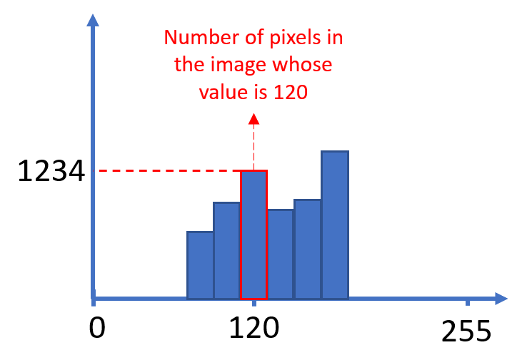
First and foremost, let’s provide a quick introduction to what the image histogram is. A digital image is nothing but a collection of pixels. If the image is grayscale, each pixel is assigned an intensity value, typically ranging from 0 (black) to 255 (white). If the image is a standard RGB color image, each pixel is assigned three values, one per color channel (Red, Green, and Blue). Each value typically ranges from 0 to 255.
Now, let’s focus on grayscale images for simplicity. The image histogram plots on the X-axis the 256 possible intensity values, and on the Y-axis the total number of pixels in the image having each value. This is graphically explained below:
Therefore, looking at the image’s histogram is a quick way to analyze how levels are distributed. Now, in Amped FIVE it’s super easy to constantly monitor the histogram of the pixels you’re seeing in the Viewer panel. You just need to activate the Histogram tool from the Tools menu (which by default sits on the left side, below the Filters panel).
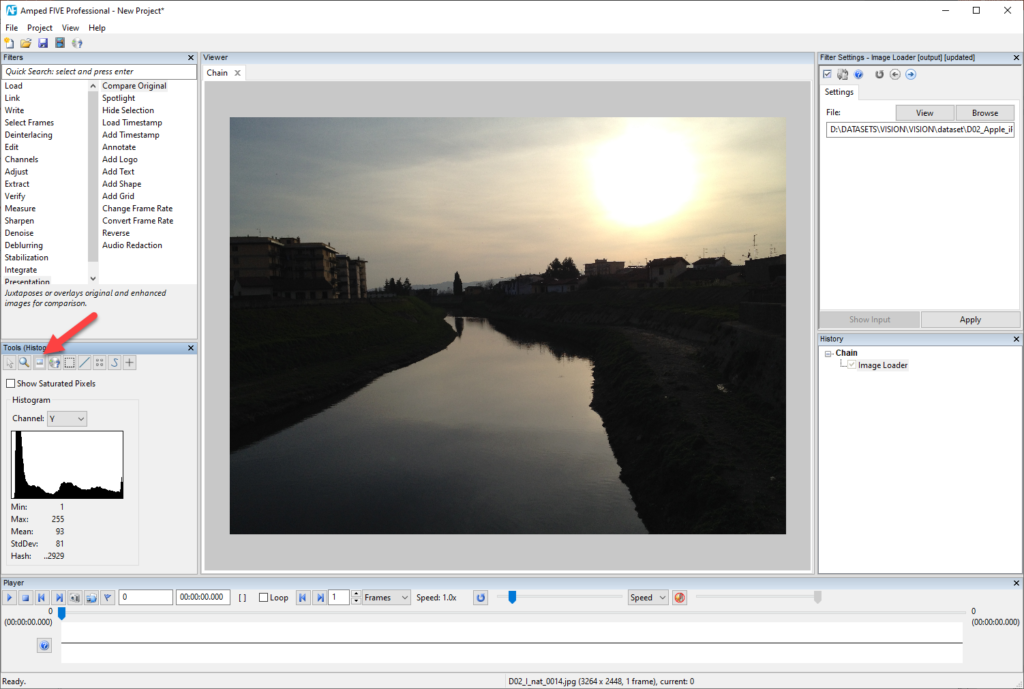
In the example above, looking at the image we notice a large amount of dark pixels, some mid-bright pixels in the sky and river, and some very bright pixels in the sun. This is well reflected by the histogram’s shape!
Now, in general, we’re happy when the histogram is well distributed across all levels since that means we’re “making the most” of the available intensity range. On the contrary, we’re unamused when we see a squeezed histogram like the one below.
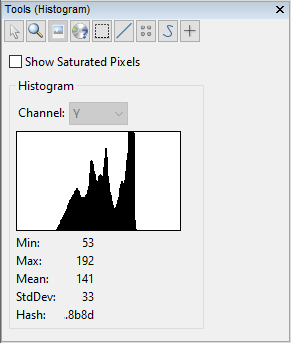
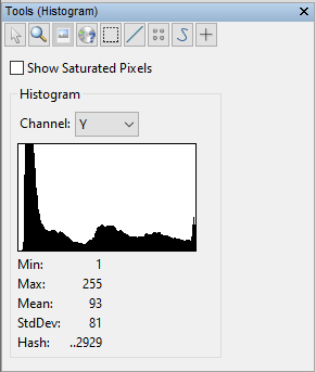
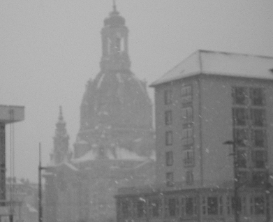
The darkest pixel in the image has a value of 53 (as shown in the “Min:” row ) and the brightest has a value of 192 (“Max:” row). We’re thus wasting all levels from 0 to 52 and from 193 to 255! Before looking at the image that generated such a histogram, let’s stop and think. We expect the image to have most pixels with approximately the same grayish values. And this is indeed the case: we have a picture where pixels are grayish, because of the weather.
In cases like the one above, filters in the Adjust category can usually help a lot. They allow us to map pixel intensities to new values, in order to exploit better the available 0-255 range. Even the simple Contrast Brightness tool can make a big difference. As we increase the Contrast slider, we see the histogram gets wider and wider, so that we exploit more and more of the available range.
You can instead use the Levels filter. It’s very instructive to see how the output histogram changes as you adjust the filter’s parameters. What is important to notice is that the histogram you see in the Filter Settings panel is the histogram of the input image. While the histogram you see in the Tools panel is the output (what you currently see in the Viewer!)
Now, the great thing about understanding the histogram is that you can use it to justify the enhancements you do. Instead of saying “I’ve increased the contrast because my gut told me to”, you could say “I increased the contrast because the histogram was clearly collapsed to the center”.
So, basically, increasing the contrast of an image means making its histogram wider, while adjusting the brightness will simply shift the histogram towards the right side (if you increase the brightness) or towards the left side (if you lower the brightness).
Therefore, when given a dark and poorly contrasted image, a sensible way to go is to first adjust the brightness to place the histogram at the center. Then, increase the contrast to stretch it and exploit more gray levels, and possibly iterate until the histogram is well-positioned and wide.
A final remark: in the examples above, you may have noticed that even when using color images we were seeing just one histogram, and not one per color. That’s because the Histogram tool by default shows the histogram computed over the luminance of the image (represented by the “Y” letter in the dropdown menu). However, you’re free to see the histogram computed on each color channel, or an aggregated histogram showing the luminance and all colors superposed.
You may be surprised to see yellow, purple, and cyan colors in the aggregated (“All”) histogram. These colors are just a way to plot histogram bins that are simultaneously red and blue (magenta is used), red and green (yellow is used), green and blue (cyan is used), or all of the three together (gray is used).
Finally, you’ve certainly spotted that “Show saturated pixels” checkbox in the Histogram tool. We did not talk about it here because we already dedicated a whole tip to it. The same goes for the Hash row at the bottom: we’ve explained its purpose in this previous tip.
That’s it for today! We hope we’ve convinced you that looking at an image’s histogram is a great way to start working on it and provide an objective justification for what you do.