
Amped Authenticate users know how important it is to understand the processing history of an image, and they (hopefully!) know that “processing history” does not mean just splicing.
For example, there are cases where the image has been scaled or re-compressed, and
when one of these happen you should be aware of it, as they bring important consequences to the rest of your investigation.
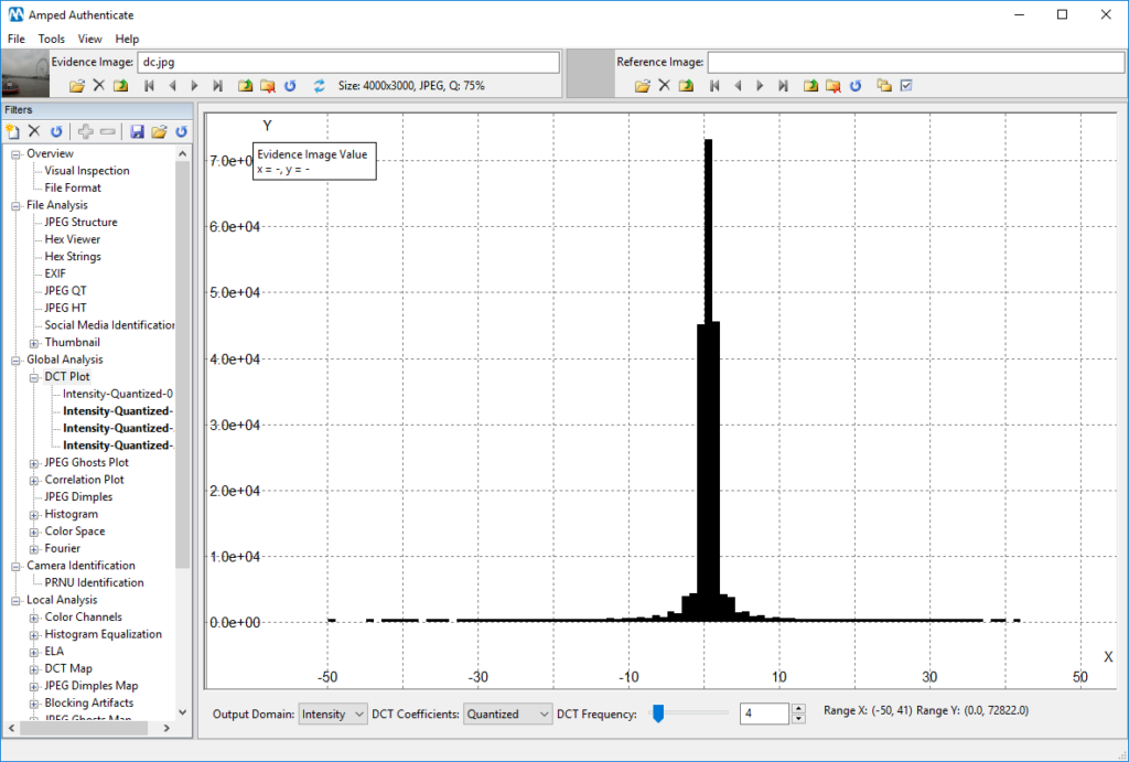
Amped Authenticate offers many tools for processing history analysis under the Global Analysis filter category. Some of these, for example the DCT Plot, the Correlation Plot, and the JPEG Ghost Plot are… plots! They should be examined carefully, because we know that artifacts like a “comb-shaped” DCT histogram strongly suggests double JPEG compression, and so does a JPEG Ghost Plot with multiple local minima. The problem is… sometimes it’s just hard to see these artifacts, because they are “hidden” in the plot!
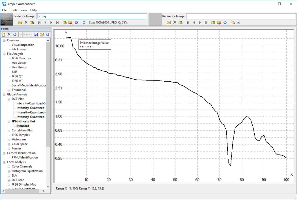
Consider the image below: at a first glance, its DCT Plot for DCT Frequency 4 seems rather “smooth”, and you could easily overlook it.
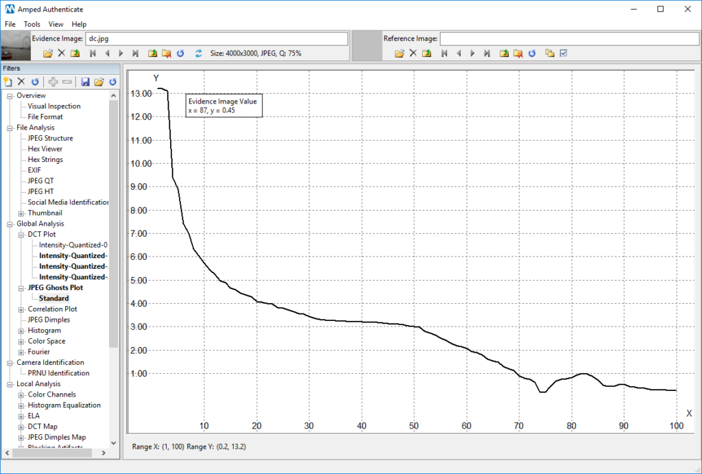
A similar reasoning applies to the JPEG Ghost Plot obtained for the same image: the only evident local minimum is located in 75, just where we expect it (since the image last estimated compression quality is indeed 75, as you can see in the top bar “Q: 75%”).
Just before us concluding that the above plots suggest “absence of traces of double compression”… today’s Tuesday Tip enters the game! And the tip is: try to watch your plot in log-scale. Log-scale means that the scale of the Y-axis is no longer linear (that is, the displacement between two ticks is always the same, so we may have three consecutive ticks in 10, 20, 30, etc.) but it becomes logarithmic instead (which means: the displacement between two ticks increases at exponential
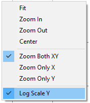
Why is that useful? Because using a log-scale will “compress” high values and “exalt” smaller ones, allowing you to find subtle differences. Turning on the log-scale is as easy as right-clicking on the plot and select the “Log Scale Y” item from the menu:
This will only affect values representation, without any need to re-compute anything, so the “conversion” between linear and logarithmic scale is lightning fast.
Now, let’s look again to the DCT Plot and JPEG Ghost Plot we had before, starting from the first one:
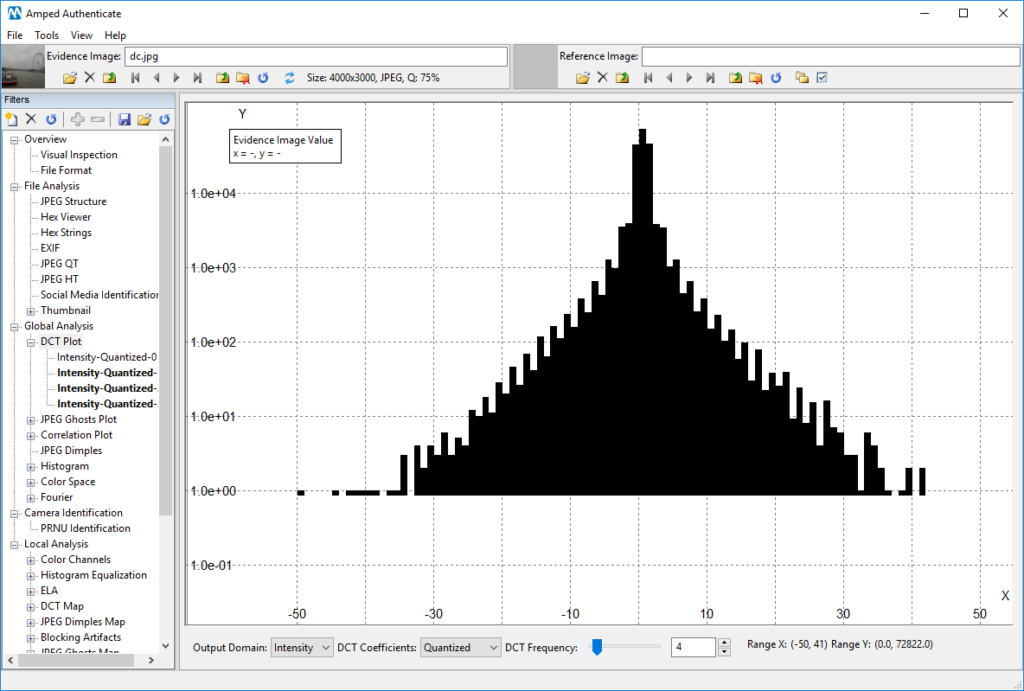
I’m sure you agree that now we can definitely spot a regular “comb-shaped” pattern here! Keep in mind we are seeing the same data, just in a different scale. We are now more confident that the image underwent two compressions, the latter of which at quality 75. Can we also say something about the previous one? Well, let’s go to the JPEG Ghost Plot, this time using the log-scale:
There is now a rather evident secondary local minima in 87! And that could indeed be the quality of the former compression. (As Authenticate nerds could have noted, the fact that the former compression is at higher quality than the latter was already suggested by the DCT Plot. Indeed, although we have the comb-shaped histogram, we do not have “empty” bars, that are instead typical when the last compression quality is higher than the first).
Before concluding, an important remark: when you turn on the log-scale, be careful to keep an eye to the tick labels drawn on the Y-axis, especially when dealing with histograms: in a log-scale histogram, a bar whose actual height is just 6 could seem very prominent! Of course, you are not basing your image authentication on such a small amount of samples (we recommend to start considering bars in the DCT plot when they count tens or even hundreds of samples). To clarify this important point, let’s look once more at the DCT Plot we had shown before: as you can notice, the height of most of the bars is well above the “1.0 e+01” mark on the Y-axis, which means “more than ten samples” (1.0 e+01 means 1.0 x 10^1 = 10). Many of them are also well above the “1.0 e+02” tick, which means they count more than one hundred samples (1.0 e+02 means 1.0 x 10^2 = 100). However, if you find reading the log-scale on the left difficult, remember you can hover with your mouse over the bar, and read its element count in the top-left textbox!
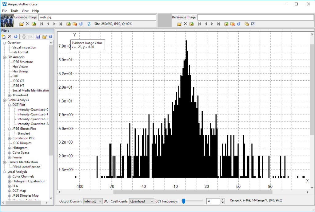
In the image shown below, for example, you should absolutely discard the “peaky” bars on both sides of the histogram, because their element count is less than ten (their corresponding tick on the Y-axis is below 1.0 e+01). These bars should be considered “noise” and should not affect your conclusions.
There’s your new Tuesday Tip on Authenticate! See you next Tuesday!