In the recent post detailing the latest release of Amped Authenticate, 7644, we highlighted the new functionality included in the Correlation Plot.
When it comes to investigating a digital image, it is fundamental to understand as much as possible about its processing history. The more we know about the digital history of the image, the better we can design our way towards authentication. For example, we can properly choose which filters make sense to use and which not. Not only that, we may also find that some processing was carried that seriously undermine the integrity of the image, or gather evidence supporting authenticity of the image.
The Correlation Plot is a powerful tool in Amped Authenticate for detecting traces left by many different processing operations. It has been part of Authenticate for some time, but we recently worked hard to make its output easier to interpret and understand.
Before looking at the enhancements, what does the correlation plot do?
Briefly, it exposes regular correlation patterns between neighboring pixels. In most cases (that is, leaving out images containing regular textures mostly), these are introduced by image processing operations involving interpolation, like resize, rotation or stretching.
Let’s consider a trivial, mono-dimensional example: we want to double the size of this vector of pixels: [124 130 112 122]. First, we create a new vector of the desired size and fill it with available values: [124 ?? 130 ?? 112 ?? 122 ??]. Then, we may take the average of neighboring pixels to compute the missing values: [124 127 130 121 112 117 122 122]. Since bold values have been interpolated from neighboring ones, they are strongly correlated with them. The Correlation Plot exposes traces of interpolation even when much more complex interpolation formulas have been used.
Let’s move to some practical examples: we begin with this camera original image (captured with a Nikon D50): This is the corresponding Correlation Plot that we obtain:
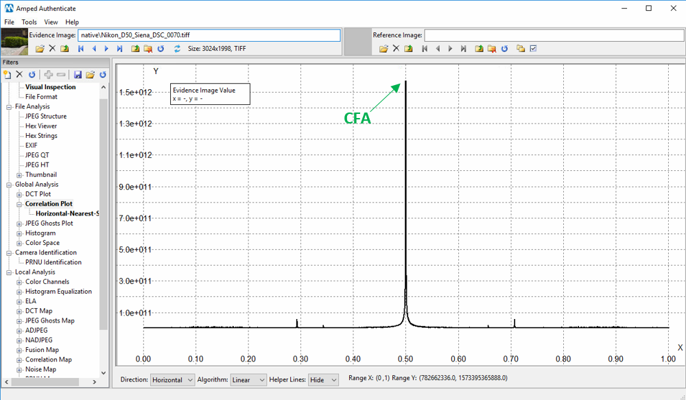
Notice the huge peak located at normalized frequency (X-axis) 0.50. That is just the consequence of the Color Filter Array demosaicing algorithm doing its job, that is, generating interpolated values for red, green and blue pixels. Presence of this peak is indeed an important clue towards image authenticity and integrity, as the peak often disappears or becomes secondary in processed images. There are other, minor peaks that are also related to in-camera processing of the image. Notice that the plot is symmetric with respect to the central value (0.50), so in the following we’ll only discuss the leftmost part of the plot.
Now, let’s compress the image in the JPEG format and compute again the correlation plot:
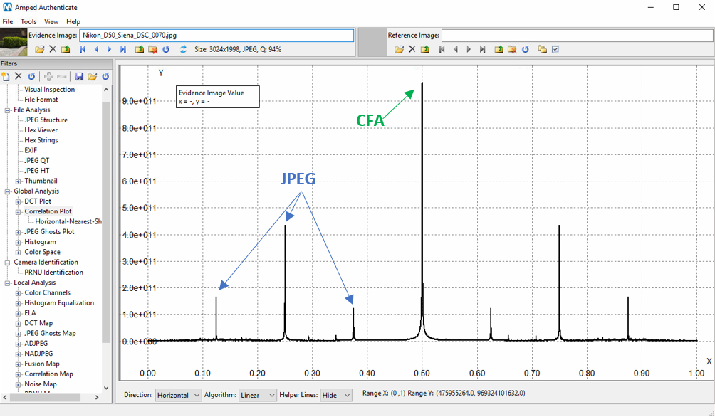
Besides the camera-related peaks, we have new strong peaks. These peaks are due to the blocking artifact introduced by JPEG-compression, and always appear in those positions, if the image has not been resized/rotated after compression.
Now, let us upscale the image by a factor 1.5 and see how the plot changes:
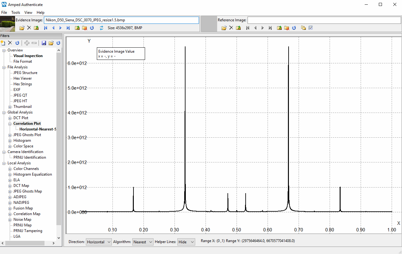
We see that a new, huge peak appears at frequency 0.33. This peak is due to the interpolation caused by the resizing operation, and its position gives a clue about the amount of resize (see the Authenticate manual for a full explanation about peaks positioning).
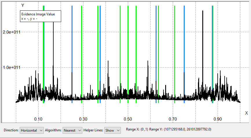
In order to facilitate the user distinguishing “innocuous” peaks due to camera-processing and JPEG compression from suspect peaks, the filter has a new feature called “Helper Lines”. Once activated, it plots green lines at frequencies where camera-related peaks are expected and blue lines at JPEG-related frequencies. For example, this is what we get for the JPEG-compressed version of the image we have seen before:
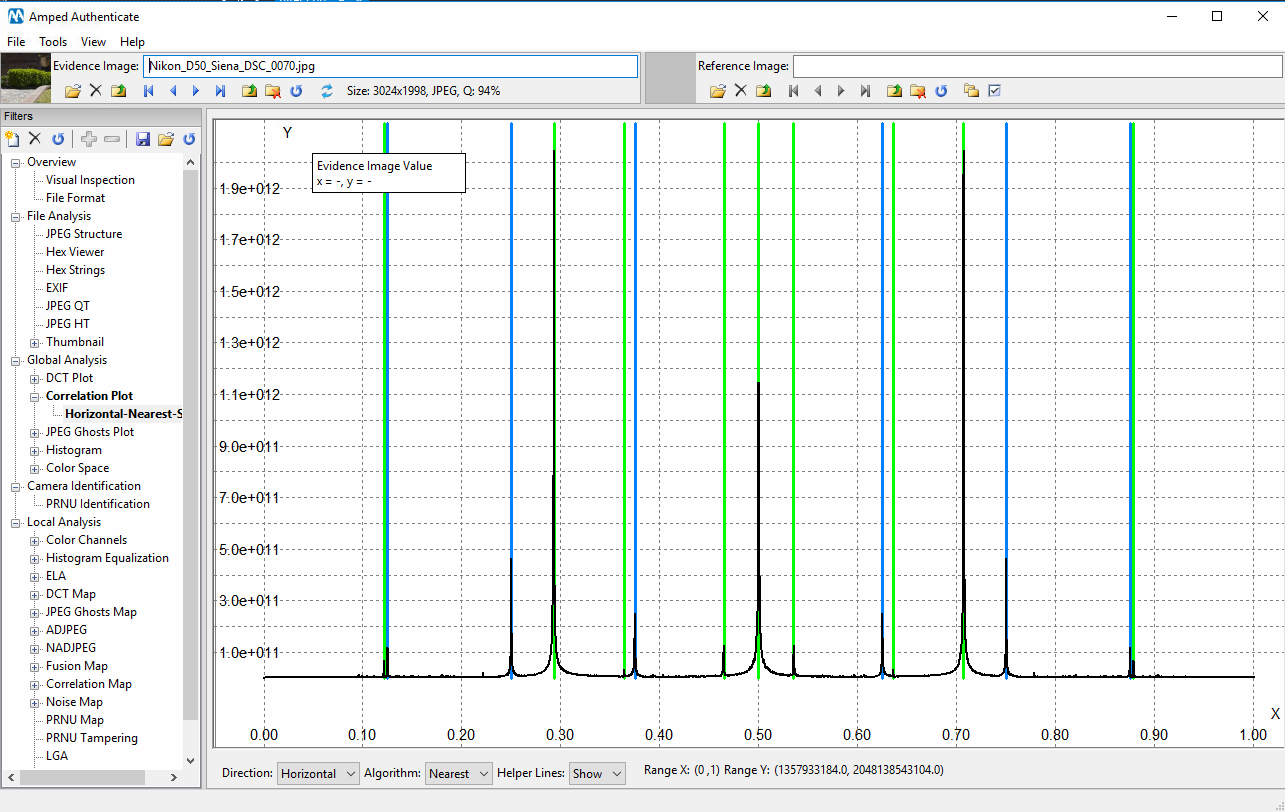
Since all spikes overlaps with helper lines, this plot gives no clue of “malicious” interpolation, as expected.
The Correlation Plot is a powerful tool, able to expose reliably interpolation due to global resize and rotation even when they are very slight (for example, resize by 2% or rotation by 3°).